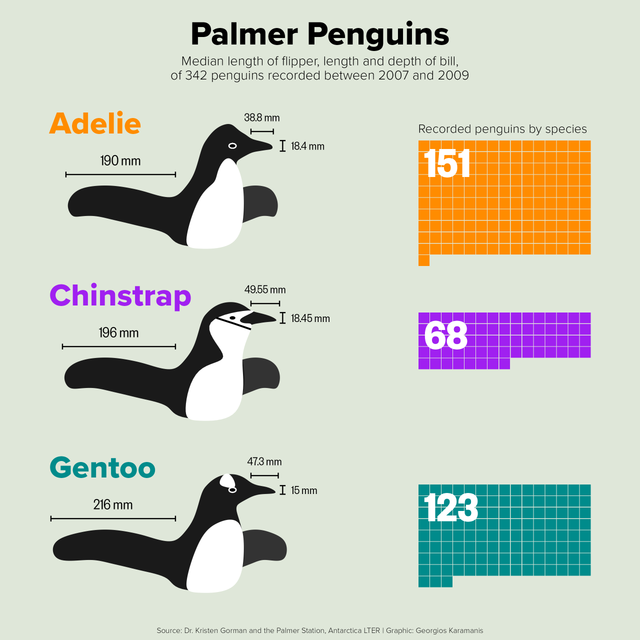
30DayChartChallenge 2025
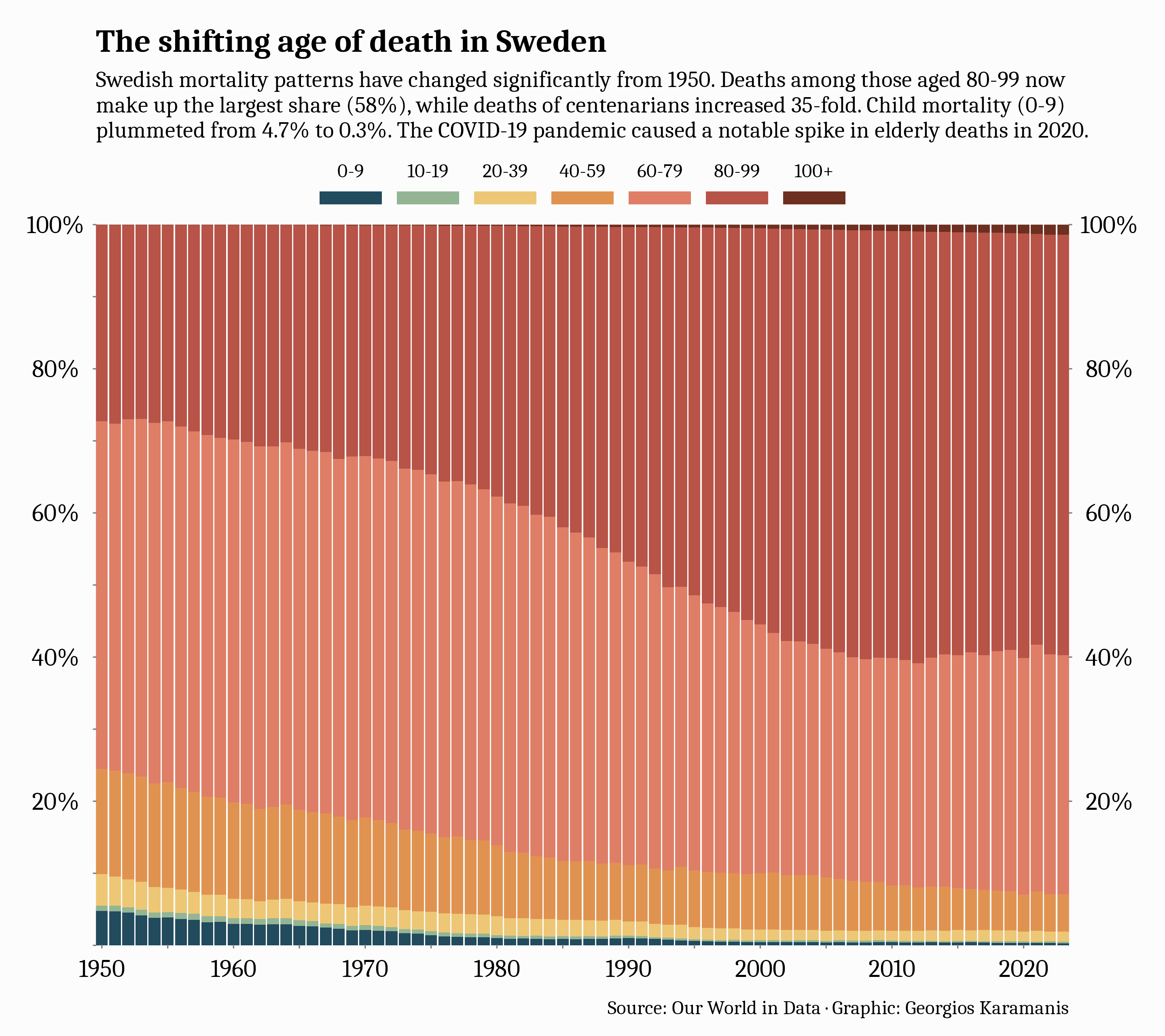
Day 1: Fractions
Share of deaths by age group in Sweden, 1950-2023
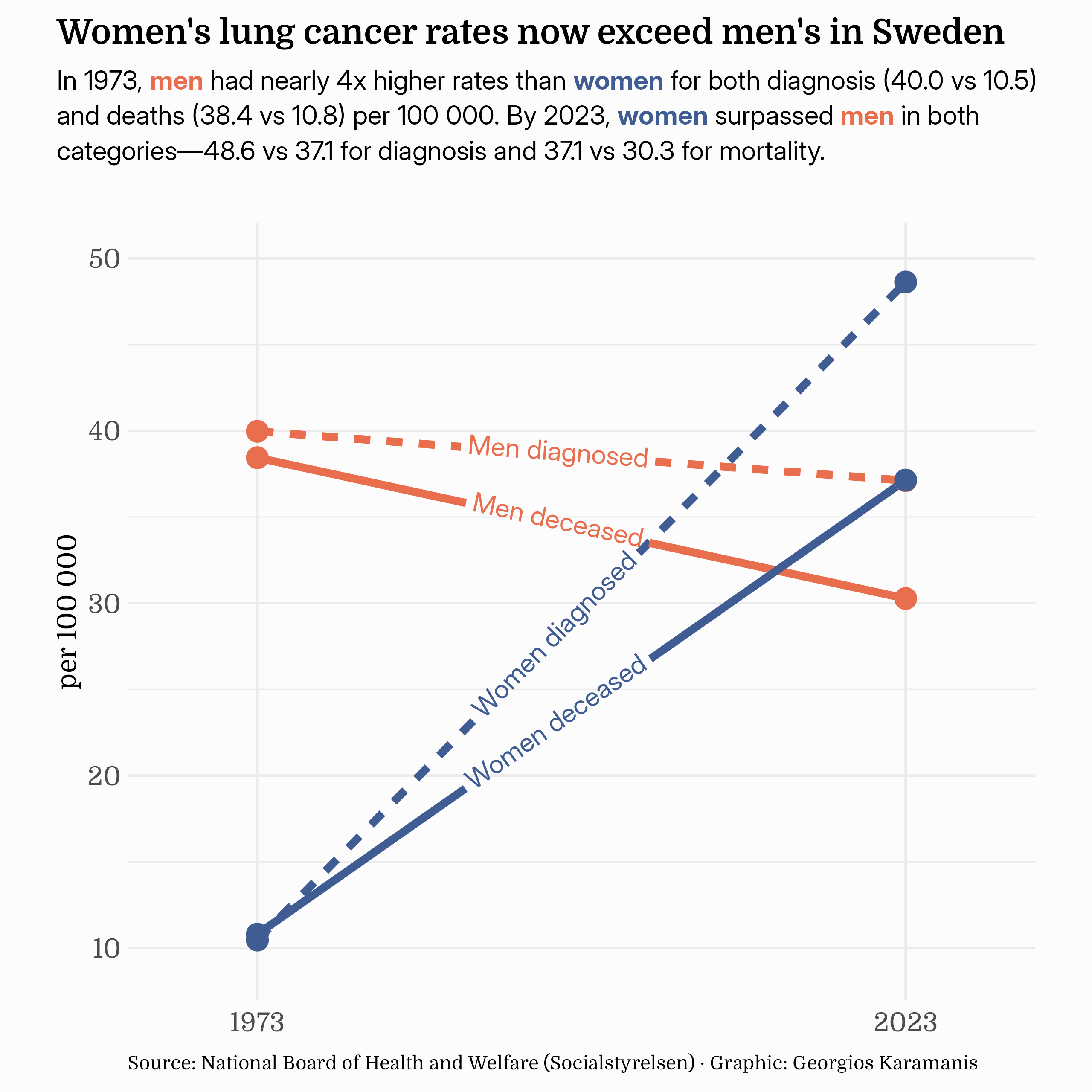
Day 2: Slope
Lung cancer diagnoses and deaths in Sweden, 1973-2023
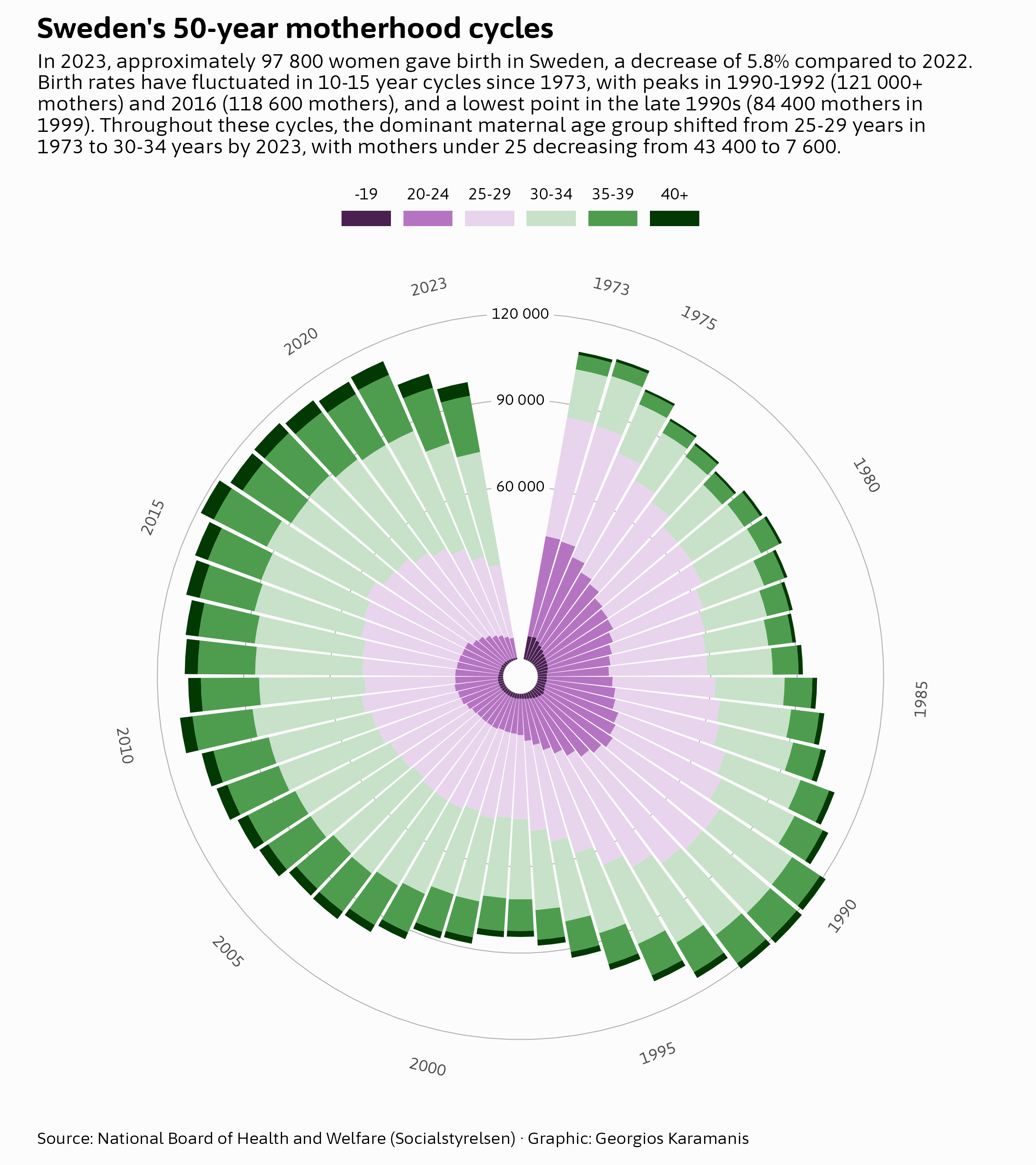
Day 3: Circular
Sweden’s motherhood cycles
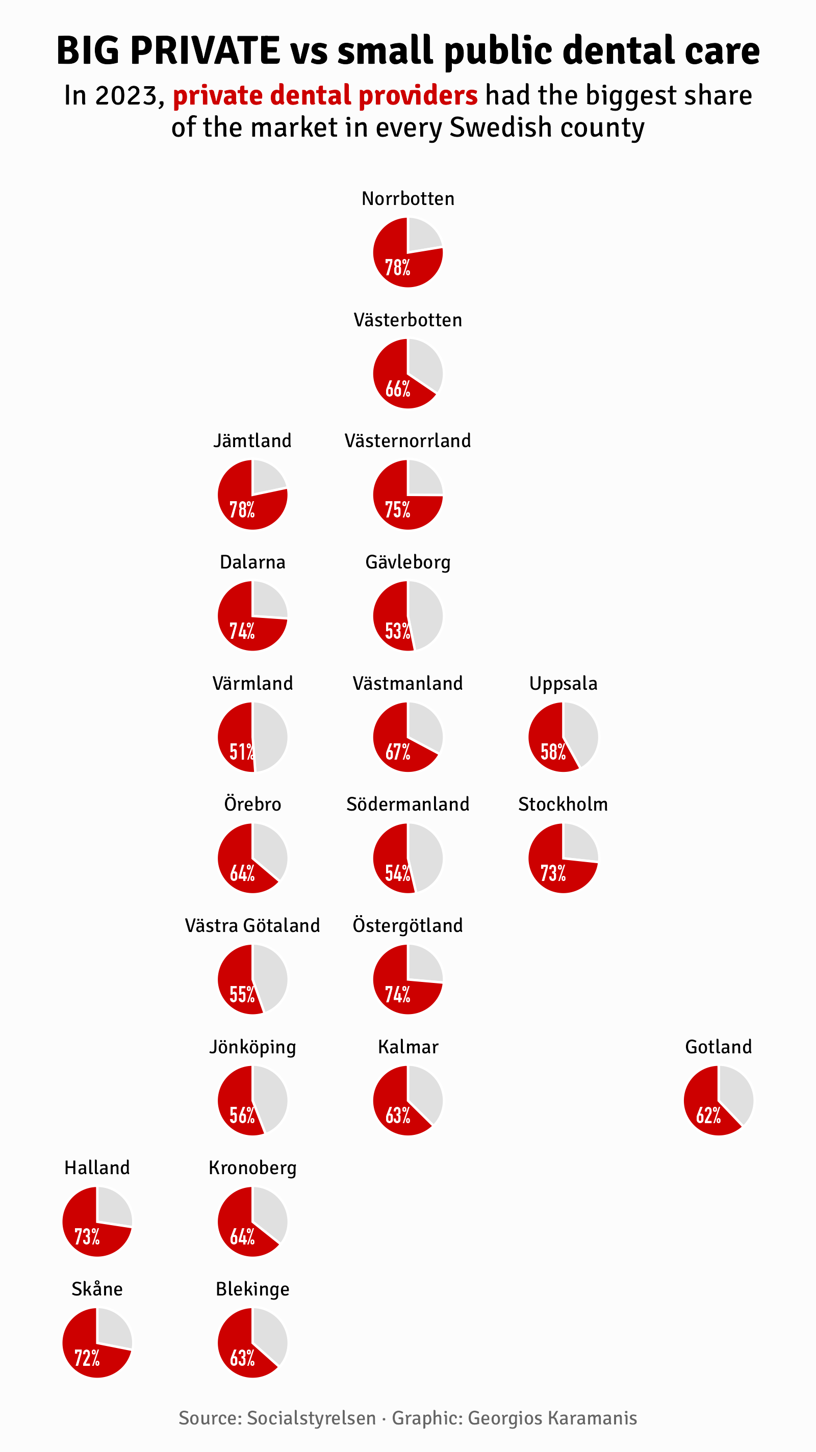
Day 4: Big or Small
BIG PRIVATE vs small public dental care
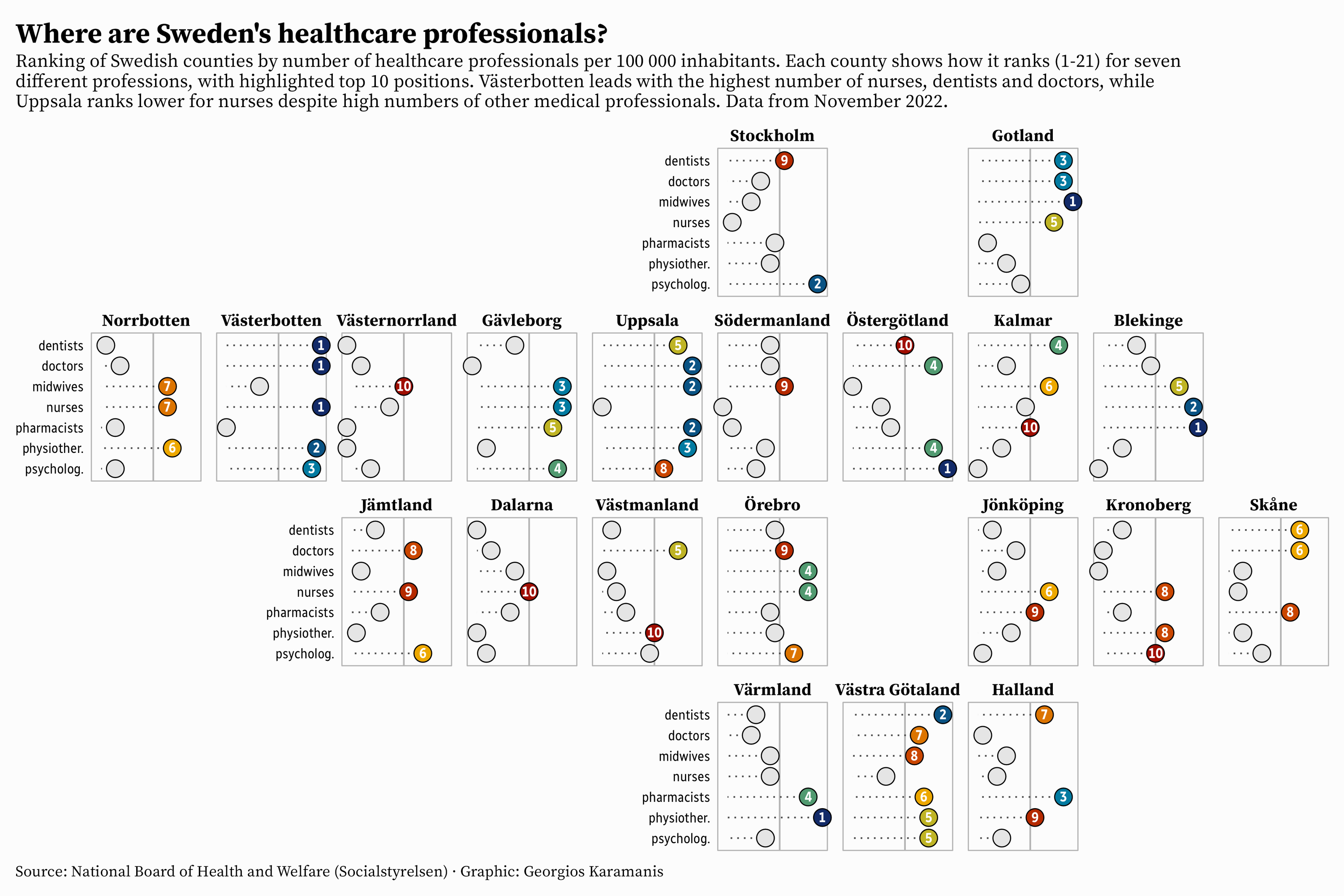
Day 5: Ranking
Ranking of Swedish counties by number of healthcare professionals
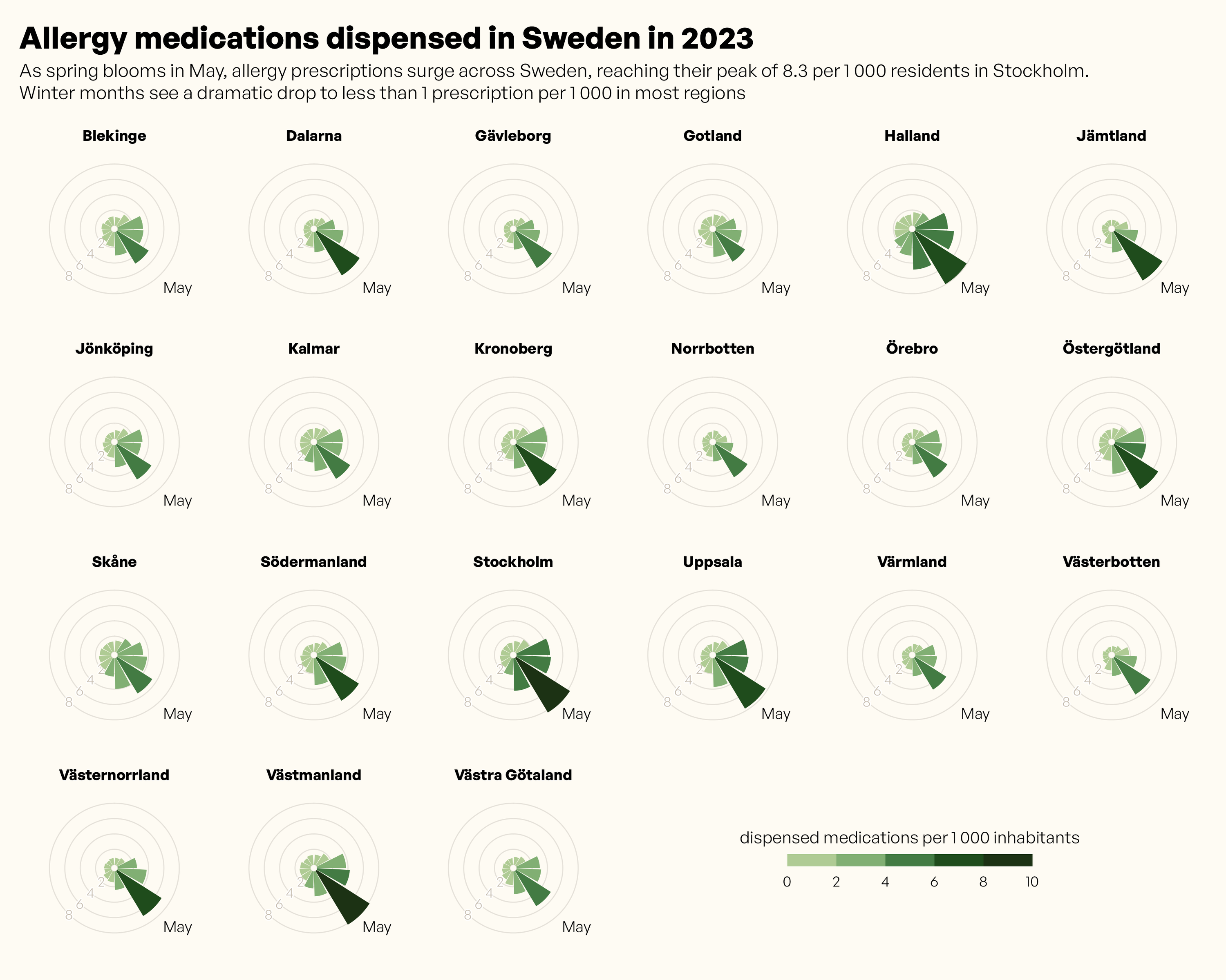
Day 6: Nightingale
Allergy medication prescriptions in Sweden
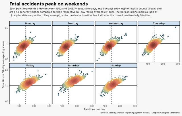
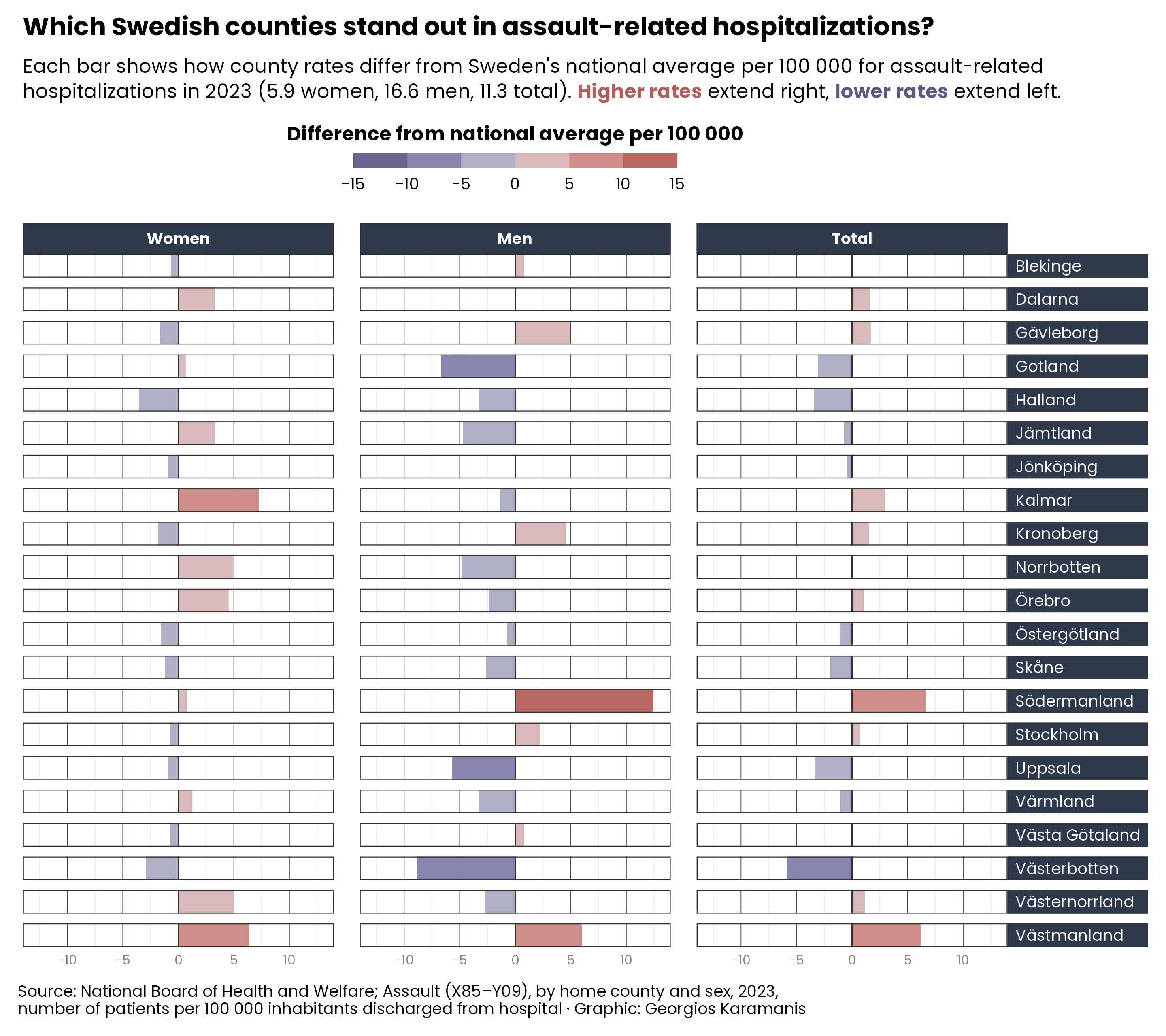
Day 7: Outliers
Assault-related hospitalizations in Sweden
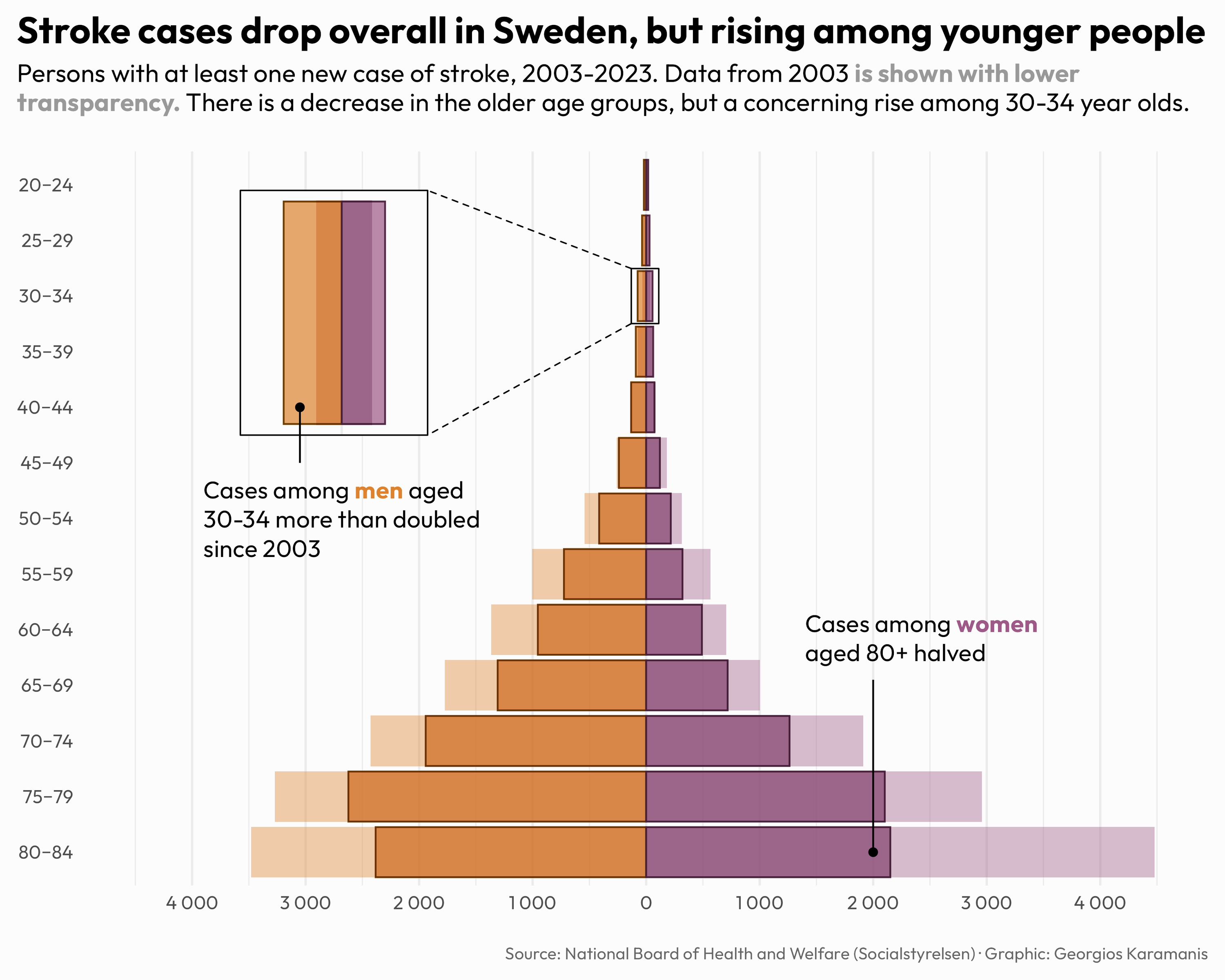
Day 9: Diverging
Stroke cases in Sweden, 2003-2023
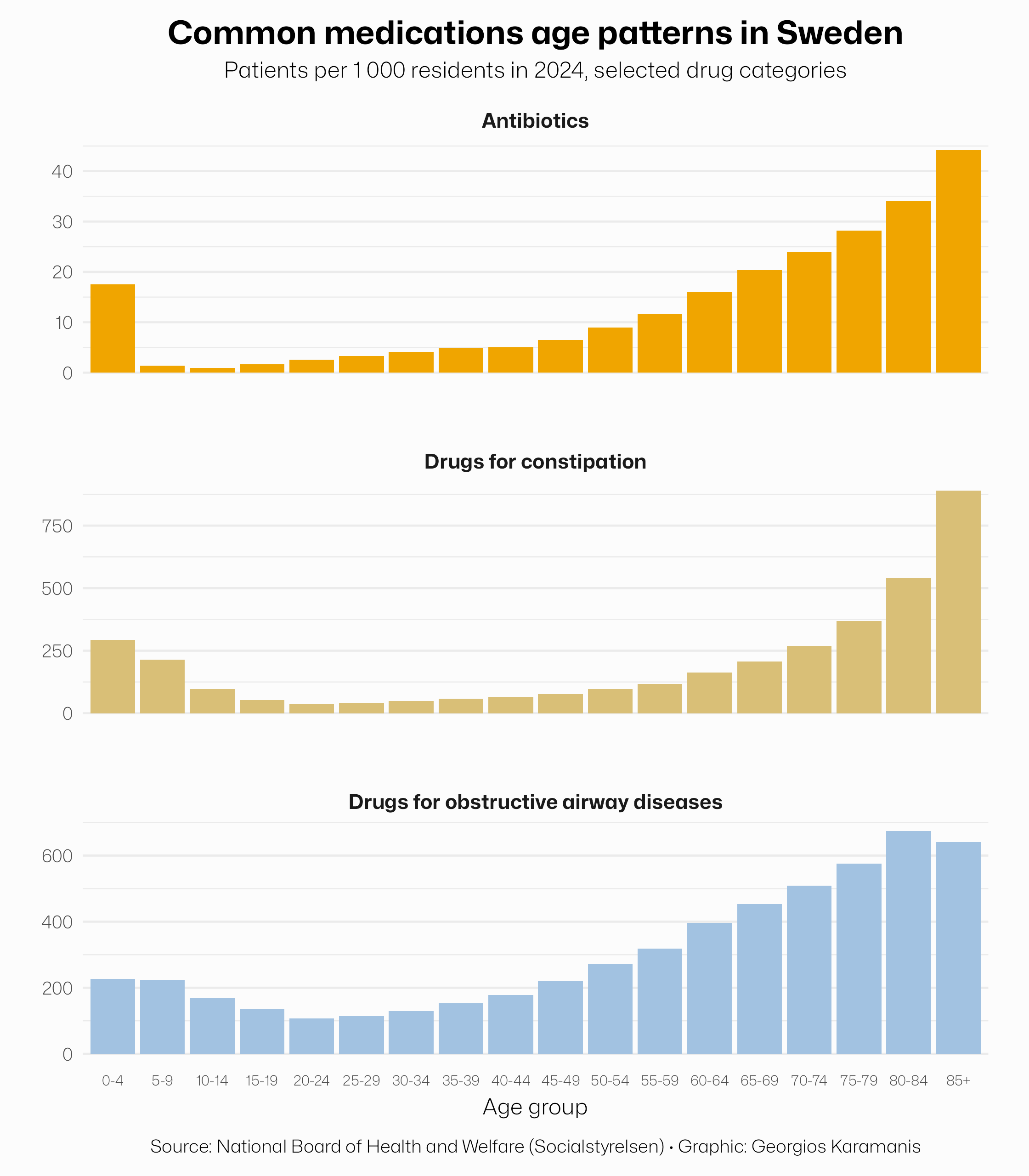
Day 10: Multimodal
Selected medication groups with bimodal age distribution in Sweden
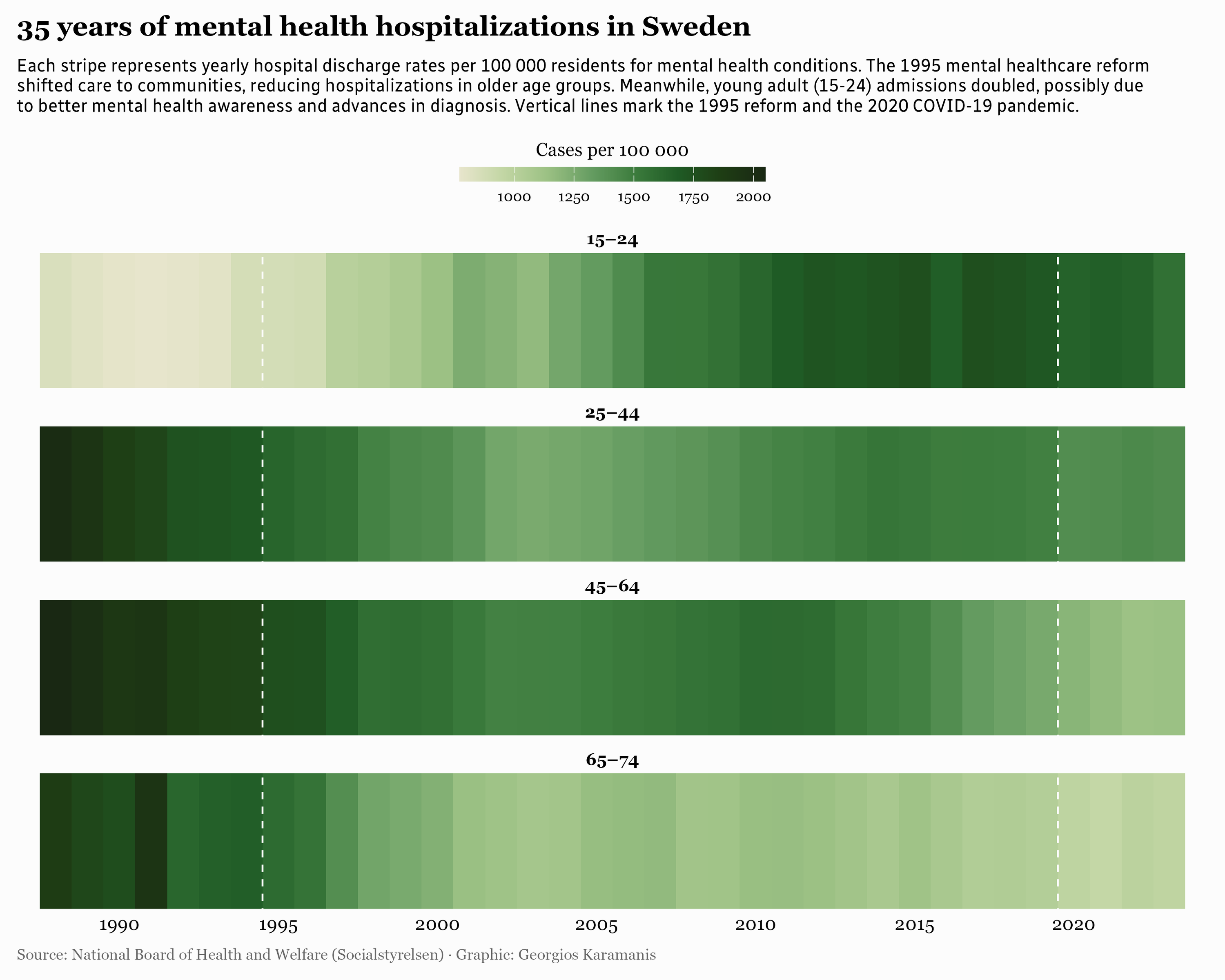
Day 11: Stripes
Hospitalizations for mental health conditions in Sweden
Day 13: Clusters
Percentage of population receiving municipal care
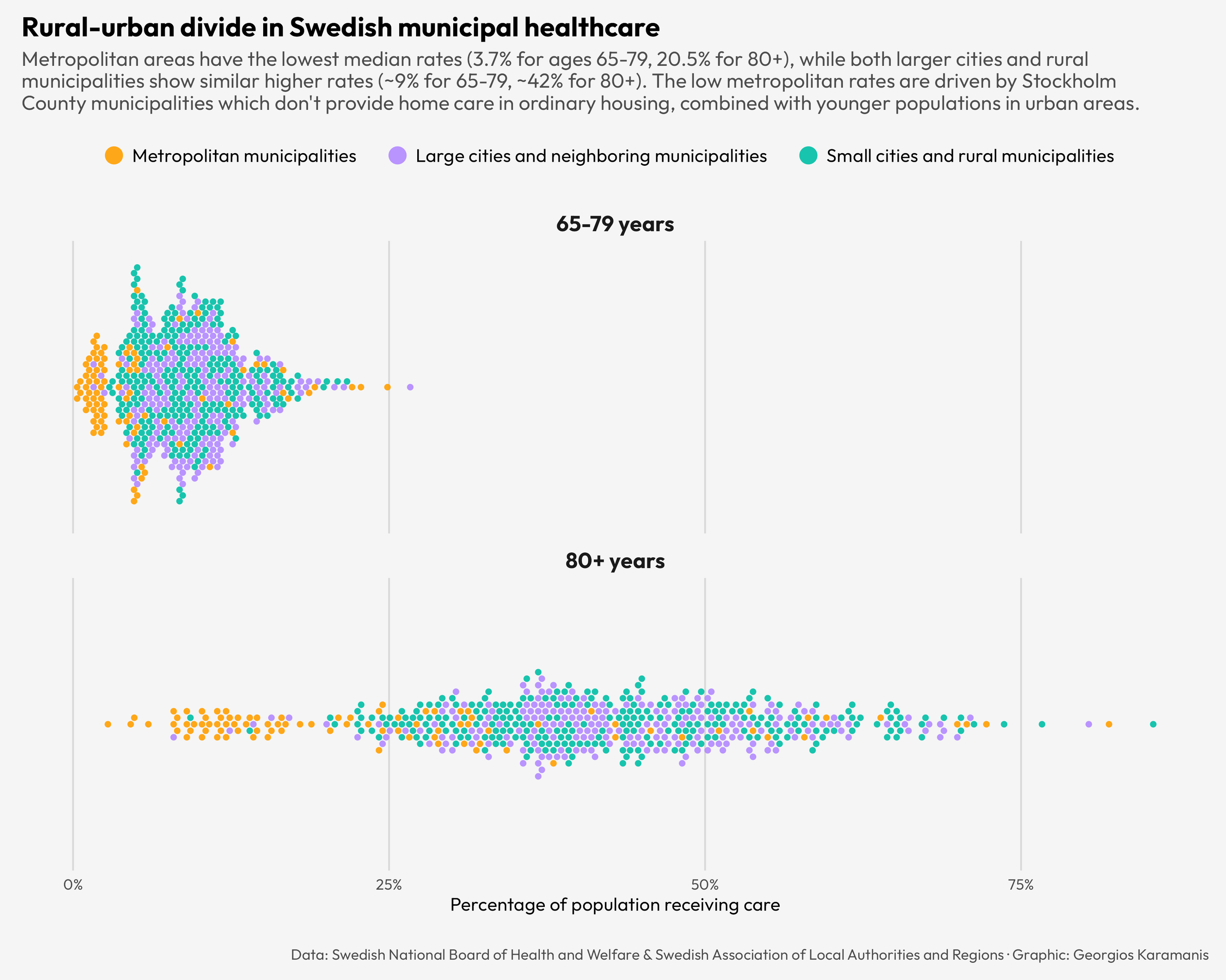
Day 13: Clusters
Percentage of population receiving municipal care
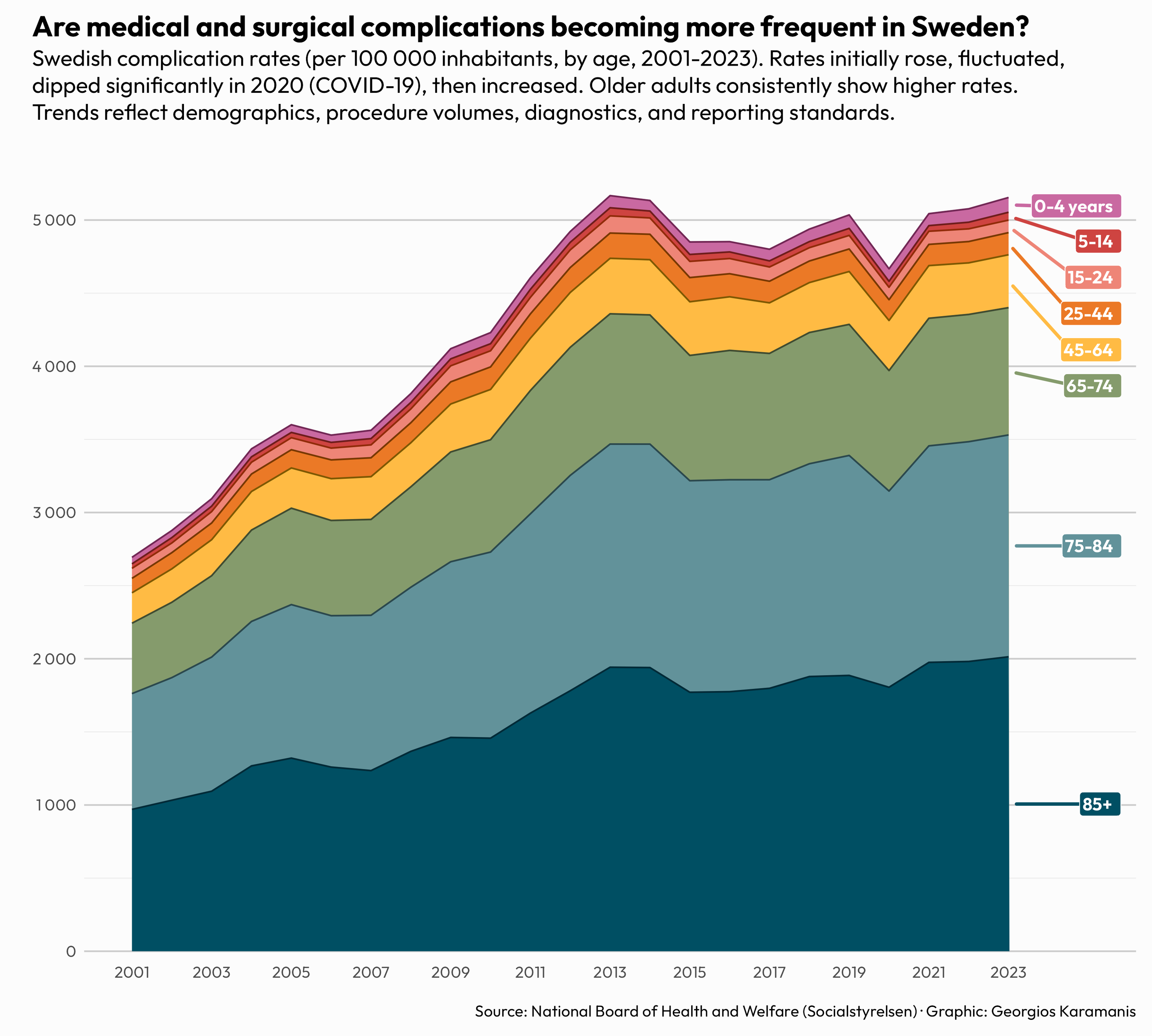
Day 15: Complicated
Hospital discharge rates in Sweden due to medical and surgical complications
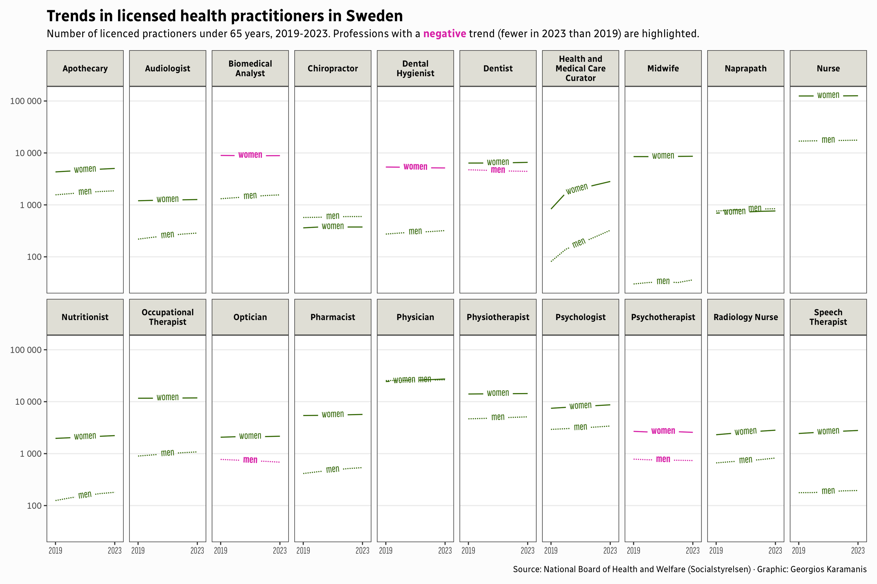
Day 16: Negative
Trends in licensed health practitioners in Sweden
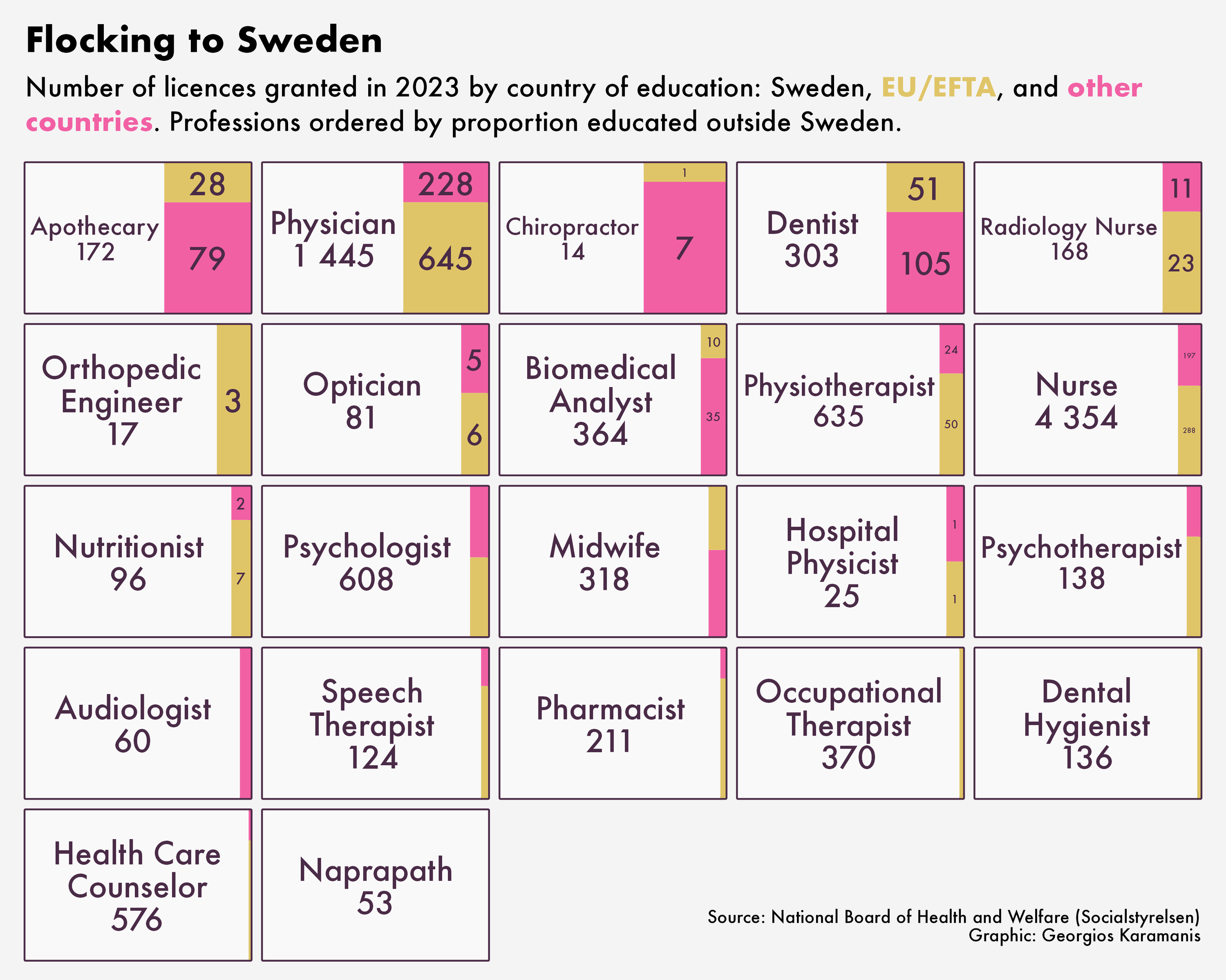
Day 17: Birds
Professional licences in Sweden by country of education
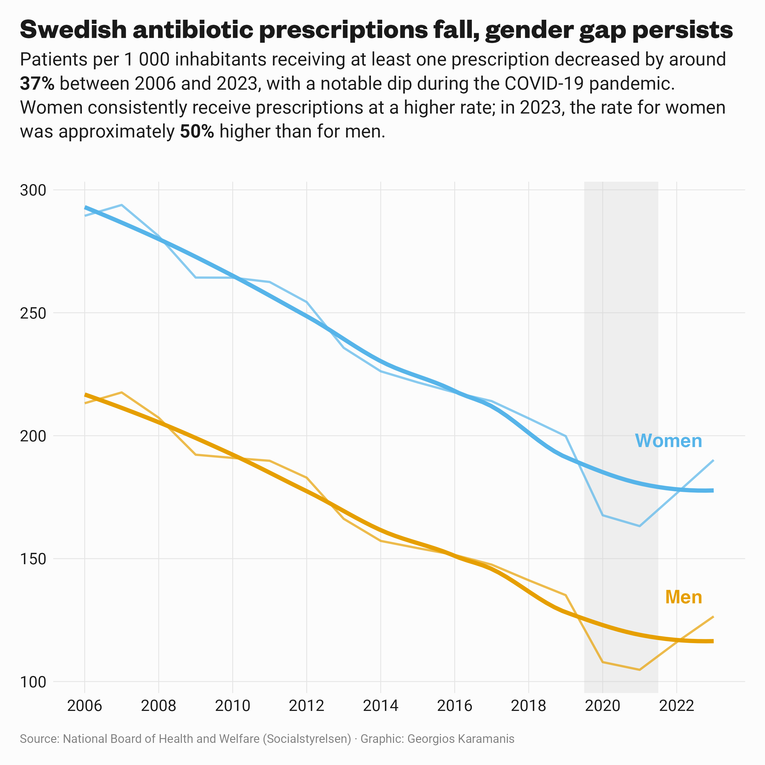
Day 19: Smooth
Antibiotics in Sweden are declining
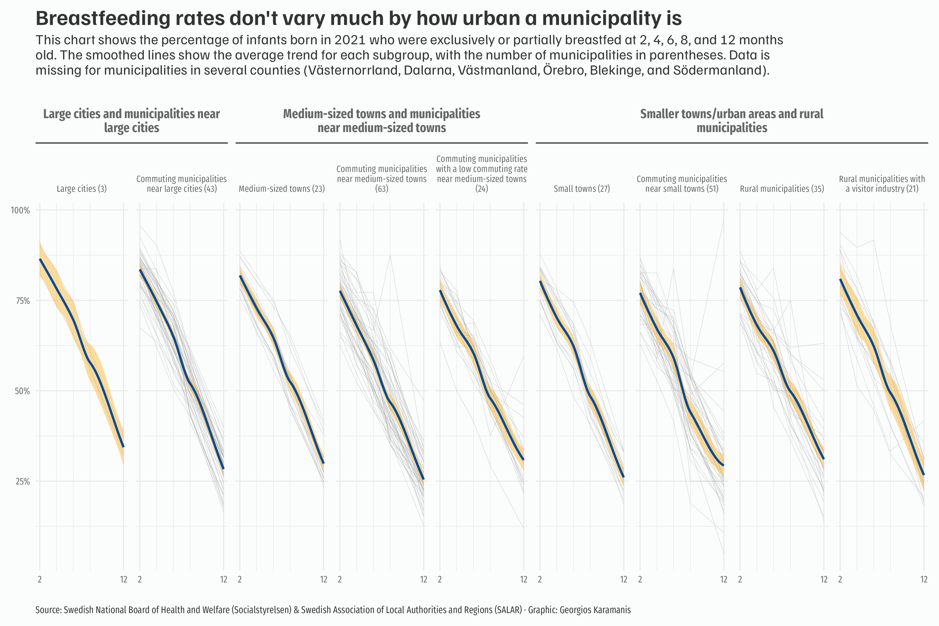
Day 20: Urbanization
Breastfeeding during the first year in Swedish municipalities by degree of urbanization
Day 22: Stars
Breastfeeding during the first year in Swedish municipalities by degree of urbanization
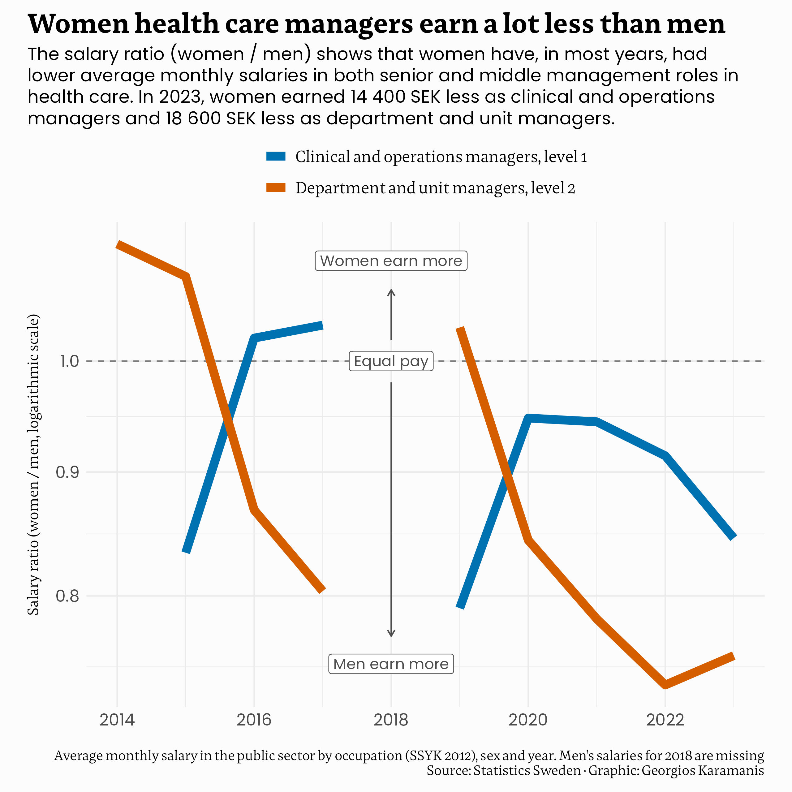
Day 23: Log scale
Women health care managers in Sweden earn a lot less than men
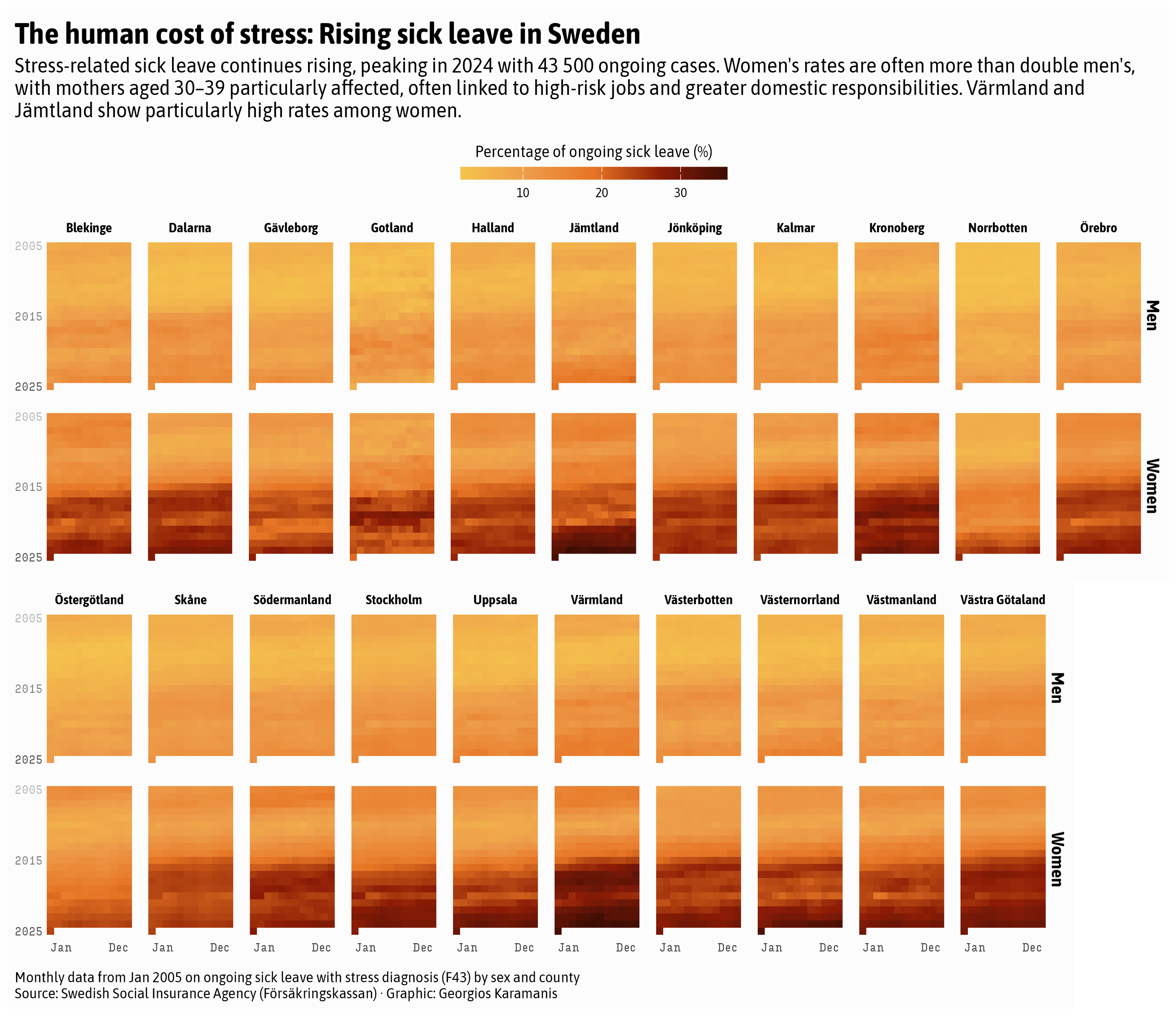
Day 26: Monochrome
Sick leave due to stress is rising in Sweden, especially among women
Code for all charts on GitHub