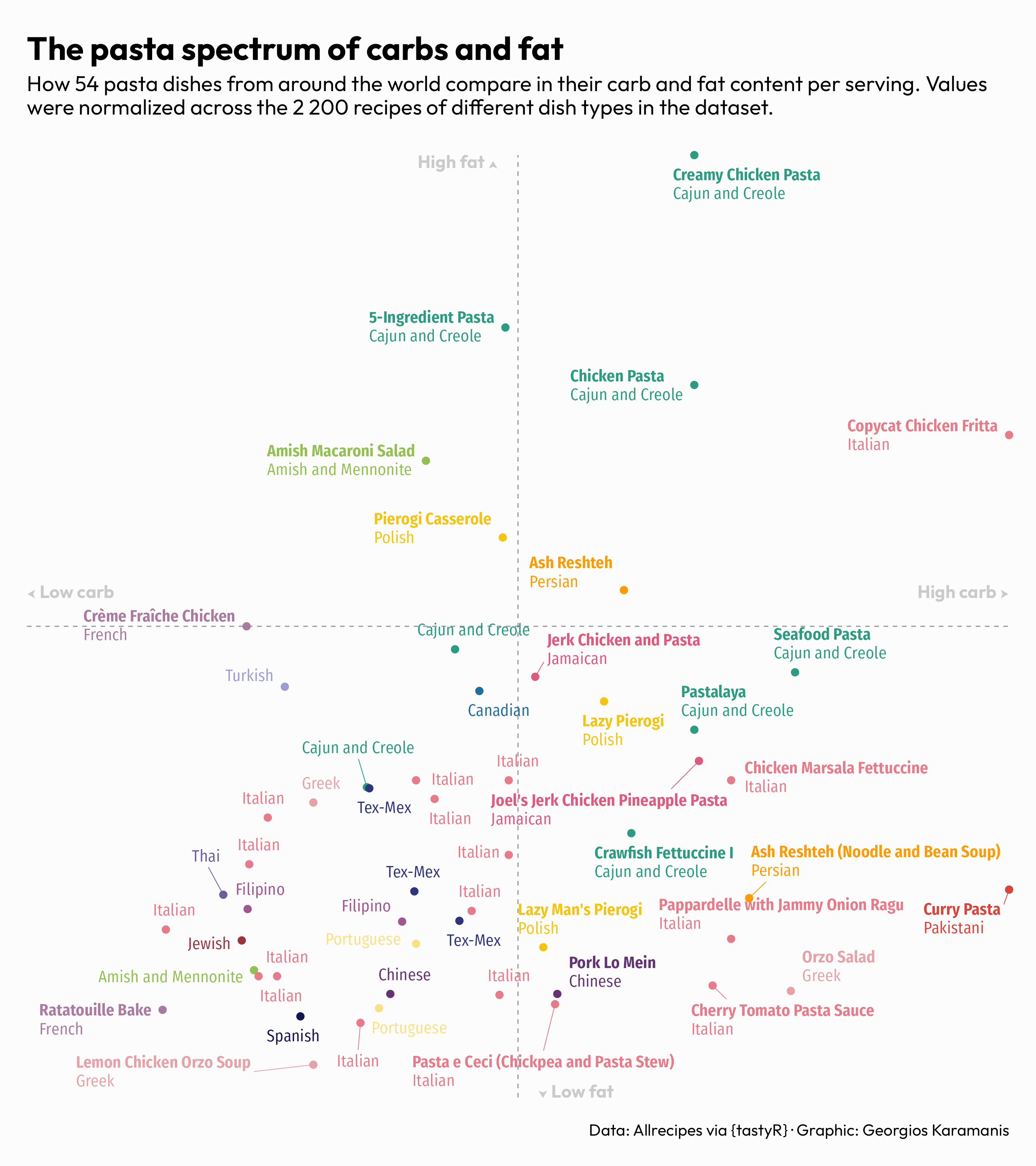
TidyTuesday 2025/38
Up next
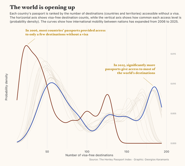
TidyTuesday 2025/37
Latest posts
TidyTuesday 2025/38
TidyTuesday 2025/37
TidyTuesday 2025/36
TidyTuesday 2025/35
TidyTuesday 2025/34
TidyTuesday 2025/33
TidyTuesday 2025/32
TidyTuesday 2025/31
TidyTuesday 2025/30
TidyTuesday 2025/29
TidyTuesday 2025/28
TidyTuesday 2025/27
TidyTuesday 2025/26
TidyTuesday 2025/25
TidyTuesday 2025/24
TidyTuesday 2025/23
TidyTuesday 2025/22
TidyTuesday 2025/21
TidyTuesday 2025/20
TidyTuesday 2025/19
TidyTuesday 2025/18
TidyTuesday 2025/17
30DayChartChallenge 2025
TidyTuesday 2025/16
TidyTuesday 2025/15
TidyTuesday 2025/14
TidyTuesday 2025/13
TidyTuesday 2025/12
TidyTuesday 2025/11
TidyTuesday 2025/10
TidyTuesday 2025/09