TidyTuesday 2021/40
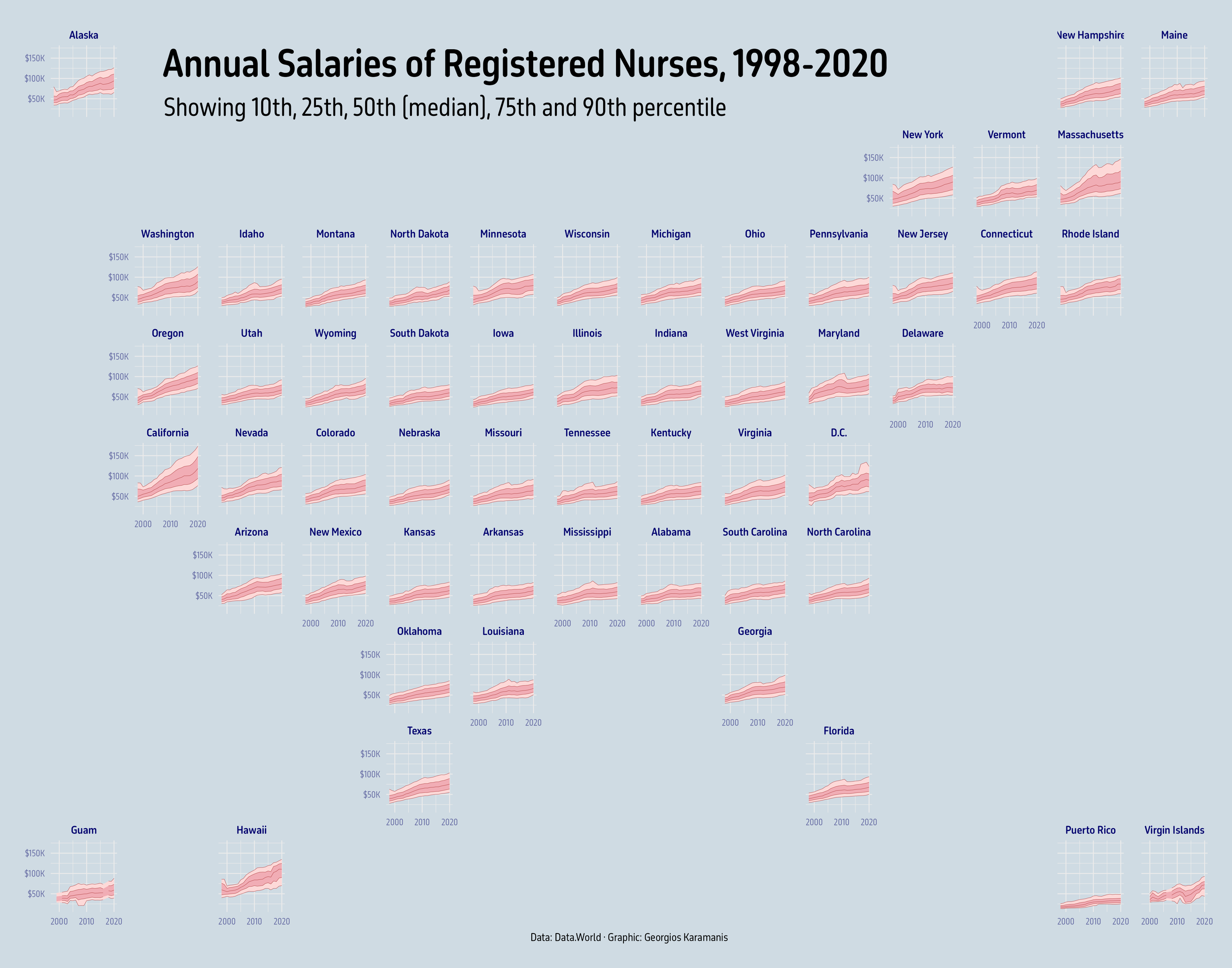
For this week’s #TidyTuesday I used {ggfan} to show the median salaries (and other percentiles) of US registered nurses from 1998 to 2020.
[

](The image shows the evolution of annual salaries of registered nurses in the US by state and year, from 1998 to 2020. The image consists of multiple plots arranged into a grid that represents the place of the state in the US map. Each plot shows the median salary, as well as the 10th, 25th, 75th and 90th percentile. )
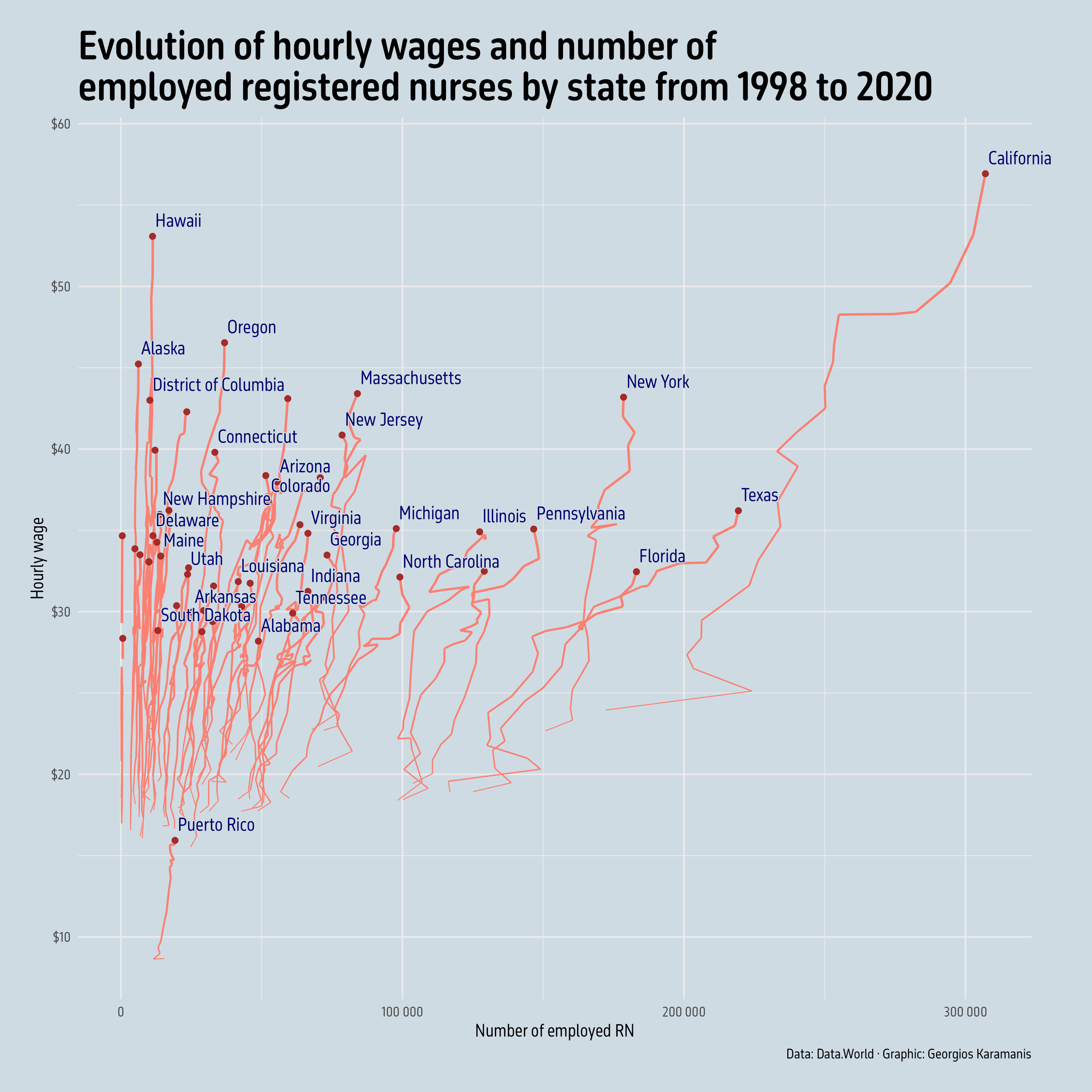
This week I made a second plot, a connected scatterplot showing the evolution of hourly wage and total number of employed registered nurses by state from 1998 to 2020.

code and full size images on GitHub
Up next
TidyTuesday 2021/39
For last week’s #TidyTuesday I combined two plots (actually three with the legend) showing the number and proportion of papers distributed by NBER
TidyTuesday 2021/41
Seafood production in Greece for this week’s TidyTuesday. The inspiration for the plot was a data visualization from 1906 from this tweet. code and
Latest posts
TidyTuesday 2025/37
TidyTuesday 2025/36
TidyTuesday 2025/35
TidyTuesday 2025/34
TidyTuesday 2025/33
TidyTuesday 2025/32
TidyTuesday 2025/31
TidyTuesday 2025/30
TidyTuesday 2025/29
TidyTuesday 2025/28
TidyTuesday 2025/27
TidyTuesday 2025/26
TidyTuesday 2025/25
TidyTuesday 2025/24
TidyTuesday 2025/23
TidyTuesday 2025/22
TidyTuesday 2025/21
TidyTuesday 2025/20
TidyTuesday 2025/19
TidyTuesday 2025/18
TidyTuesday 2025/17
30DayChartChallenge 2025
TidyTuesday 2025/16
TidyTuesday 2025/15
TidyTuesday 2025/14
TidyTuesday 2025/13
TidyTuesday 2025/12
TidyTuesday 2025/11
TidyTuesday 2025/10
TidyTuesday 2025/09
TidyTuesday 2025/08